Fitness Tech Product Photos Why Neutral Gray Backgrounds Convert Better
See why mid-gray makes wearables pop, then grab our lighting, shadow, and export checklist—plus a fast Pixflux.AI workflow for consistent backgrounds.
 Sierra CappelenJanuary 10, 2026
Fitness Tech Product Photos: Why Neutral Gray Backgrounds Convert Better
Shoppers don’t zoom into smartwatch bezels or earbud charging cases on the first pass—they scan rows of thumbnails on Amazon, Best Buy, or Google Shopping. If your product shot sits on a busy gym floor or a high-contrast studio white, details blur and specs get lost. For wearables and fitness gear, a clean, neutral gray background can be the difference between a glance and a click.
In 2026, dark-mode shopping UIs and comparison grids favor images that are consistent, readable, and color-accurate. That’s exactly where a neutral gray background excels: it preserves contrast without glare, keeps colors honest, and leaves room for overlays like “battery life” or “water resistance.” If you’re ready to simplify your workflow, AI tools such as Pixflux.AI make it easy to switch to a neutral gray background without re-shooting your catalogue.
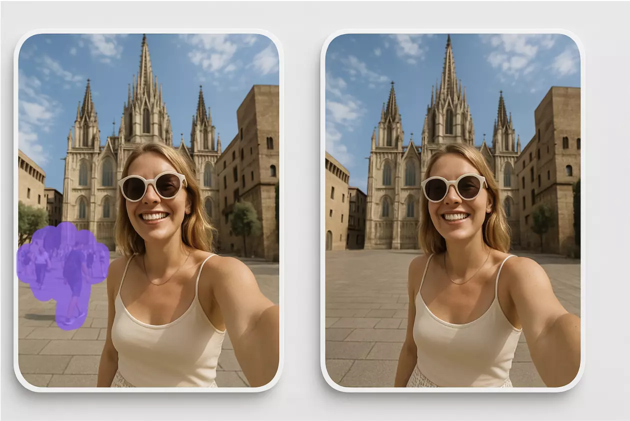
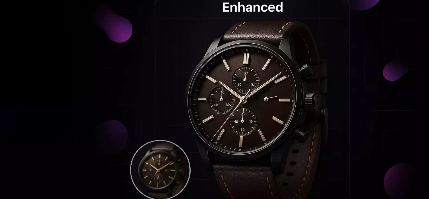
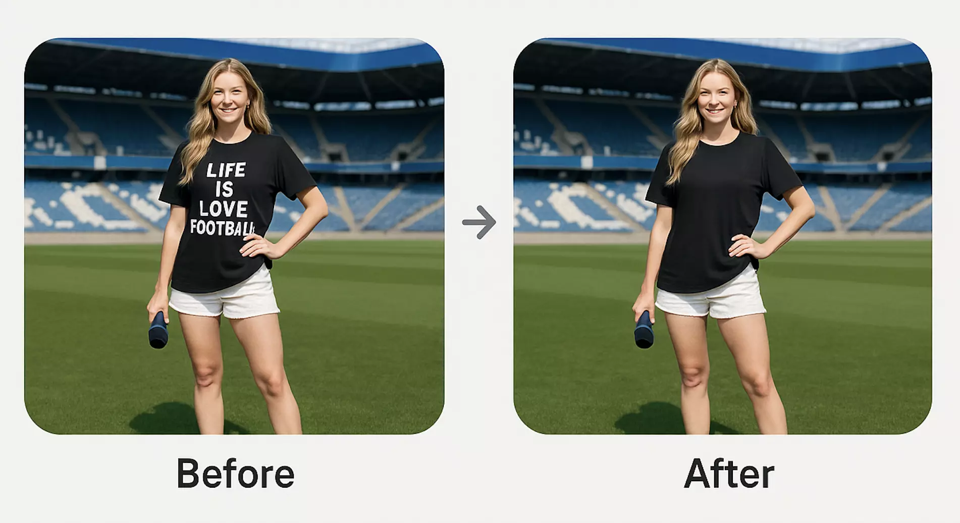
(See image: Before-and-after composite of a smartwatch on a busy gym backdrop vs the same watch on neutral gray with a natural ground shadow and legible feature callouts.)
Why gray backgrounds boost conversions for fitness tech products
Wearables are small, glossy, and reflective. On pure white, they can look blown out or floaty; on black, they can lose edge detail. A mid-gray backdrop gives you:
- Legible edges across dark and light SKUs (e.g., graphite vs silver watch cases)
- Honest color for bands and screen UI (less color cast)
- Space for text overlays that don’t fight the background
- Natural-looking shadows that anchor the product and add depth
Marketplaces and comparison engines increasingly favor consistency. A set of images shot or generated on the same gray helps thumbnails align visually, producing a cleaner shelf and less cognitive friction—especially on smartphone-first browsing.
Visual psychology: contrast, color accuracy, and readability on gray
- Contrast that reads at a glance: Mid-gray supports both white and dark-toned products. Micro-contrasts (knurling on a bezel, mic meshes on earbuds) remain visible.
- Saturation control: Gray doesn’t “push” hue the way colored backdrops can. That’s important for band colors and product finishes that must match customer expectations.
- Overlay readability: Specs, badges, and CTA chips are easier to design when your canvas isn’t absolute white or deep black. White text with slight drop shadow or black text at medium weight both work on gray.
Tip: Aim for a balanced mid-gray—think studio “18% gray” as a starting point. You can nudge brighter or darker based on SKU and marketplace requirements.
Gray vs white vs black backgrounds: when each works for wearables
- Gray background: Best default for multi-SKU fitness tech lines. It balances contrast and color fidelity, and plays nicely with dark-mode UIs.
- White background: Useful for marketplaces that mandate pure white (e.g., Amazon main image). Beware overexposed edges on glossy equipment; add controlled ground shadows.
- Black background: Dramatic for premium wearables or hero banners. Risky for darker SKUs and thumbnails; edge separation and reflections can get tricky.
Many brands combine: main image on white (to meet rules), alternates on gray for detail, and dark hero shots for ads. AI background editing lets you maintain this mix without separate shoots.
Lighting fundamentals for neutral gray product photos of fitness gear
Use this quick setup checklist:
- Two softboxes at 45°: Soften reflections on glossy surfaces and avoid hard specular hotspots.
- Overhead fill or large bounce: Tames top reflections on watch glass and earbud cases.
- White balance card: Calibrate in-camera or in post; consistent color is critical on gray.
- Exposure target: Protect highlights on glass and metal; lift midtones in post if needed.
- Polarizing filter (optional): Reduces glare on screens and coated plastics.
- Distance from backdrop: Keep product a meter from the backdrop to avoid harsh spill and to control shadow sharpness.
- Aperture: f/8–f/11 is a good starting point for full-object sharpness on small products.
(See image: Lighting diagram—two 45° softboxes, overhead fill, gray seamless backdrop, callouts for exposure and shadow angle.)
Shadow control on gray: soft edges, ground shadows, and gradients
Shadows sell realism, especially on AI-edited backgrounds:
- Soften edges: Aim for a gentle, penumbra-rich ground shadow under the product. Too crisp looks cut-out; too soft looks floaty.
- Align light logic: Make sure the shadow direction matches your key light (roughly one side darker). Consistency across SKUs matters in comparison rows.
- Use shallow gradients: A subtle radial gradient behind the product can help it pop without looking artificial. Keep it under control—view at thumbnail size to validate.
On glass screens, keep a minimal highlight line; it signals shape without overpowering.
Marketplace-ready exports: sizing, formats, and compression on gray
- Color space: sRGB for all web and marketplace uploads.
- Resolution: 2000–3000 px on the long edge for zoom; some marketplaces accept 1600 px minimum, but higher is safer.
- Aspect ratios:
- Amazon/Google Shopping: 1:1 square is common; check category rules.
- Retailer PDPs (e.g., Best Buy): 4:5 or 3:4 can feel larger on mobile.
- Formats: JPEG for hero and gallery; PNG for assets needing transparency; WebP for web if supported.
- Compression: JPEG quality 85–92 for a balance of clarity and size; inspect for banding on gray.
- File hygiene: Consistent naming, alt text with product + color + “gray background” for SEO.
Dark-mode UIs compress perceived brightness. Slightly lighter gray backgrounds (not white) often remain readable without bloom.
Pixflux.AI workflow: create consistent gray backgrounds and batch edits in 3 steps
If you already have product shots but the backgrounds are inconsistent or noisy, Pixflux.AI can quickly standardize them:
- Upload your original photos.
- Let the AI remove or replace the background and generate a mid-gray backdrop with a soft ground shadow. Use batch upload to process entire SKUs at once.
- Download the edited images and export in marketplace-ready sizes.
Start with the gray background for product photos flow to switch busy backdrops to neutral gray while preserving reflections and clean edges.
Pro tip (advanced 5-step for fine control): 1) Open the Pixflux.AI tool, 2) Upload a sample from each SKU color, 3) Choose background generation and set a mid-gray target, 4) Preview and micro-adjust shadow intensity, 5) Download, then repeat in batch for the rest.
(See image: Pixflux.AI interface—upload → AI processing → download—producing mid-gray with subtle ground shadow.)
Case examples: smartwatches, earbuds, and fitness trackers
- Smartwatches: Chronograph markers and bezel knurling often blur on pure white. On gray, micro-contrast holds, and you can show UI screens without the background overpowering brightness.
- Earbuds: Small, glossy forms benefit from stronger edge definition on gray; matte black earbuds stay visible without haloing.
- Fitness trackers: Color bands remain true-to-life; measurement text (“HRV, SpO2”) overlays stay legible.
Teams that replace cluttered studio scenes with a neutral gray set consistently report clearer thumbnails, easier spec overlays, and smoother marketplace approvals.
Quality control: histograms, banding prevention, and gray balance checks
- Histogram check: Ensure highlights aren’t clipped (glass/screen) and shadows retain detail (strap textures). Midtones should gently peak if your background is mid-gray.
- Banding prevention: On gradient grays, export at higher bit-depth when possible before final JPEG; avoid over-compressing; add minimal dither if banding appears.
- Gray balance: Sample multiple points on the background; aim for equal RGB values. If a cast appears (warm or cool), apply a subtle tint correction.
- Edge integrity: Zoom to 200% to inspect halos around hairline antennas or strap cutouts. Adjust feathering and refine edges before export.
Troubleshooting gray background issues
- Color cast on gray: Neutralize with white balance or curve adjustments. If shooting, re-check lighting gels and spill; if editing, sample the gray and apply a targeted correction.
- Noise and texture: Gray reveals sensor noise. Use mild noise reduction on the background only; keep product detail crisp.
- Halos and fringing: Re-refine mask edges; increase contrast at the edge or add a 1–2 px feather. A faint, realistic shadow can also hide minor fringe.
- Artifacts near reflective surfaces: Reduce edge sharpening. For persistent reflections of the old scene, use object removal to clean stray shapes on glass or metal.
Rights and ethics: watermark removal, permissions, and disclosure
Use watermark removal only on images you own or are licensed to edit. Removing logos, text marks, or backgrounds must not violate copyright, brand agreements, or marketplace rules. If you caption or overlay claims (“water-resistant to 50m”), ensure they’re accurate and compliant with each platform’s policies.
Pixflux.AI can help clean logos, watermarks, or stray text from your own assets, but it should never be used to infringe on another party’s intellectual property.
AI tools vs traditional methods
- Time cost: AI background generation reduces a half-day retouching block to minutes—especially when cleaning dozens of SKUs.
- Learning curve: You don’t need deep layer-masking skills. Pixflux.AI handles background removal, realistic ground shadows, and gray generation in a guided flow.
- Batch efficiency: Batch uploads allow entire colorways to be standardized in one go. That’s hard to match with manual masking.
- Consistency: A single gray preset helps cross-team imagery match, whether you’re producing shots for Amazon main images, PDP galleries, or social ads. Designers can layer specs or promo flags on top without reworking the base image.
- Flexibility: If later you want seasonal versions, you can swap the gray for a subtle gradient or on-brand texture while keeping product edges and shadows intact.
Traditional software like Photoshop remains excellent for deep compositing and complex creative campaigns, but for repeatable ecommerce output, AI tools accelerate the 80% of work that’s routine.
FAQ: Gray background product photography for wearables
What gray value should I use for wearables?
Aim for a mid-gray close to classic “18% gray.” This provides balanced contrast for both light and dark SKUs. You can go slightly brighter for dark-mode-heavy stores or darker if your product is predominantly white or silver; keep it consistent across the line.
Does a gray background work for Amazon main images?
Yes, provided your main image rules allow it, but many categories still require pure white. Check the latest Amazon category guidelines. If pure white is mandatory for the primary image, use gray for secondary gallery shots and ads to improve readability without violating rules.
How do I keep product colors accurate on gray?
Calibrate white balance and verify gray neutrality. Shoot with a white balance card and confirm equal RGB values on the background in post. If using AI edits, preview on both light and dark UI to ensure no unexpected color casts appear.
Can I process a whole catalog at once?
Yes, batch processing is ideal for standardizing a full lineup. With Pixflux.AI, you can upload multiple images, apply the same gray background and shadow settings, and download consistent results in one session—handy for multi-SKU wearables.
How do I avoid banding on a gray gradient?
Use gentle gradients, export at high quality, and avoid heavy compression. If banding appears, slightly increase noise (dither) or raise JPEG quality to 90+. Inspect thumbnails because banding often shows more at small sizes.
Is removing watermarks or logos legal?
It’s legal only when you own the rights or have explicit permission. Do not remove branding or watermarks from images you don’t control. Follow marketplace and brand guidelines; disclose edits when required.
Should I add a shadow on gray, or keep it flat?
Add a subtle ground shadow for realism. A soft, low-opacity shadow anchors the product and improves depth perception. Ensure the shadow direction matches your lighting and is consistent across angles and SKUs.
Conclusion and next steps
Neutral gray backgrounds make fitness tech products easier to scan, compare, and trust—especially in dark-mode shopping and mobile-first browsing. With the right lighting and export workflow, you’ll ship cleaner thumbnails, more legible overlays, and a consistent brand shelf.
If you want to try it without re-shooting, generate a clean gray background in minutes using Pixflux.AI. Upload your images, let the AI handle background and shadow realism, and export marketplace-ready files—then roll the same settings across your entire wearable lineup.