Home Decor Photography Warm Orange Backgrounds that Make Interiors Feel Cozy
Why warm orange backdrops trend—and how to light, style, and export home decor shots for stores and Pinterest, fast with Pixflux.AI.
 Richard SullivanJanuary 12, 2026
Home Decor Photography: Warm Orange Backgrounds that Make Interiors Feel Cozy
You’ve styled a beautiful vignette—a ceramic vase, a boucle accent chair, a knit throw—and yet the photo still reads cold on the listing page. The culprit is often the backdrop: sterile whites or muddy greys flatten texture and dampen warmth. In 2026, interior moodboards are ruled by earthy oranges, and retail teams are leaning into richer, cozier scenes to lift clicks and saves.
The good news: you don’t need to repaint studio walls or purchase endless paper rolls. AI background editors make seasonal color swaps fast, affordable, and consistent. Tools like Pixflux.AI let you remove a busy set or change an existing scene into a cohesive orange background in minutes. If you want to get hands-on straight away, try creating warm orange backgrounds for your next shoot preview or listing refresh.
Why Warm Orange Backgrounds Make Interiors Feel Cozy in 2026
Warm oranges—think terracotta, clay, amber, burnt orange—signal hearth, sunlight, and natural pigments. They make textiles look plush, wood feel richer, and ceramics more tactile. On marketplaces and social feeds, that comfort cue translates into attention: retailers increasingly use saturated, cozy backdrops to lift click-through, while vertical-first discovery platforms reward bold color that reads clearly on small screens.
Two 2026 trends shape the playbook:
- Earthy, mineral-inspired oranges dominate interior moodboards and Instagram/Pinterest saves.
- Vertical 4:5 and 2:3 ratios outperform squares for Pinterest-style discovery, so your background needs to scale beautifully and compress cleanly.
Color Theory for Orange: Hues, Tints, and Psychological Triggers
- Hue window: Aim for H 20°–40° on an HSB wheel for natural warmth.
- Saturation: 20%–55% keeps things sophisticated; oversaturation can skew toy-like.
- Brightness: 65%–85% holds shadow detail while feeling sunlit rather than neon.
How it feels:
- Terracotta and clay read grounded, artisanal, and calm.
- Amber adds a sunlit uplift for glass, brass, and reflective accents.
- Burnt orange cues autumnal richness—great for textiles, leather, and matte ceramics.
Tip: If your product color also lives near orange (e.g., cognac leather), pick a background variation that’s either lighter and less saturated or darker and slightly more red—enough separation to preserve product edge contrast.
Palette Selection: Terracotta, Clay, Amber, and Burnt Orange
Anchor tones and combination ideas:
- Terracotta (#D16A2F): Pair with off-white plaster, walnut, unglazed ceramic; adds weight and craft.
- Clay (#C65A36): Softens stone, linen, and sisal; subtle contrast for pale oak.
- Amber (#FFBF4D): Ideal for glassware, brass fixtures, rattan; feels sun-kissed.
- Burnt Orange (#CC5500): Dramatic for hero shots; use with matte surfaces and minimal reflections.
Texture matters: plaster, lightly textured paper, raw linen, and limewash effects take gradients nicely and avoid banding. For AI-generated backgrounds, introduce subtle noise or paper grain to keep gradients natural and printable.
Lighting for Soft Shadows on Orange Background Scenes
Soft shadows sell softness. Aim for:
- A large diffused key (e.g., 3×4 ft softbox) at ~45° to the subject.
- Bounce card opposite the key to lift shadow density without flattening.
- Background distance: 1.5–2 meters behind subject to minimize spill and keep orange true.
- White balance: Set Kelvin between 3200K–4200K depending on your orange; lock it to avoid shift across a batch.
Reference visual: (See image: a lighting diagram with key light + softbox, bounce card, and background distance for soft, wraparound shadows.)
Pro tip: For high-gloss products, angle lights to avoid specular orange tint on highlights; keep highlights near neutral, then let the midtones absorb warmth.
Composition and Surface Styling for Home Decor Photography
- Surfaces: Travertine, lightly grained oak, and matte ceramic complement orange without moiré or glare.
- Negative space: Leave breathing room for text overlays (price badges, pin titles) in social variants.
- Prop scale: Use one anchor prop (chair, console) and two to three smaller accents; avoid clutter that fights the orange background.
- Angles: For décor vignettes, 25°–35° above the surface offers dimensional shadows; for furniture, straight-on or 3/4 views emphasize form.
In-Camera vs Post: Getting the Orange Background Right
In-camera benefits:
- True-to-light rendering of textures with realistic falloff.
- Less risk of edge halos and color contamination on transparent or fuzzy edges (e.g., pampas, faux fur).
Post-production (AI) benefits:
- Zero reshoots for seasonal refreshes and A/B tests.
- Rapid consistency across SKUs; batch background swaps keep collections aligned.
- Ability to remove distractions (power cords, wall seams) and generate matching palettes for multi-shot stories.
Hybrid approach: Shoot on a neutral light gray to capture edges cleanly. Then use AI to change to an orange background or generate variants. For reflective items, add a real orange card off-camera to seed believable warm reflections before final AI refinement.
Pixflux.AI Workflow: Orange Backgrounds in Three Steps
Use Pixflux.AI when you need to replace, clean, or generate a warm orange background—fast and consistent across a set.
1) Upload your original image Place your hero shot or vignette photo into the browser. For crisp cutouts, choose the version with the sharpest edges and lowest noise. To jump straight in, start with orange backdrop photography in your browser.
2) Let the AI process the background Choose background change or background generation. Pick a warm orange tone (terracotta, amber, burnt orange) and preview. You can also remove small distractions, enhance clarity, and gently increase contrast to make textures pop.
3) Download the result Export in the ratio you need (square for listings, vertical for Pinterest-style posts) and save web-ready JPEG/WEBP copies.
Advanced 5-step refinement:
- Open Pixflux.AI.
- Upload your image.
- Select background removal/change, then set an orange hue that matches your palette.
- Preview and micro-adjust edge softness, add slight grain to prevent banding, and remove stray objects.
- Download final images for each ratio and resolution target.
Pixflux.AI helps with more than background swaps: you can batch-process a collection, remove watermarks from assets you own or are licensed to edit, remove unwanted objects (wires, tags), and enhance clarity to keep textiles crisp. Always ensure you have the right to edit and distribute each image.
Reference visual: (See image: the Pixflux.AI interface with the three-step flow—upload, AI background change to warm orange, preview and download.)
Export Specs: Listings vs Pinterest-style Posts
Ecommerce listings (US/global marketplaces):
- Ratio: 1:1 or platform-native (check marketplace rules); 2000×2000 px minimum safeguards zoom features.
- Format: JPEG or WEBP at quality 80–90; color space sRGB.
- Background: For marketplaces that mandate white on primary images, use white for the hero and orange variants for secondary images. Where allowed, an orange background can improve thumbnail discrimination.
Pinterest-style posts:
- Ratios: 4:5 and 2:3 perform best for vertical discovery.
- Resolution: 1500×2000 px (4:5) or 2000×3000 px (2:3) minimum; higher if you plan to crop for ads.
- Typography overlays: Reserve top/bottom safe areas; test white and deep charcoal text against your chosen orange to ensure AA contrast compliance.
Compression tips:
- Add subtle texture/grain before export to hide gradient banding.
- Keep JPEG chroma subsampling at 4:4:4 if your gradients are delicate; if file size is a concern, test WEBP.
Case Studies: Cozy Interiors with Orange Backdrops
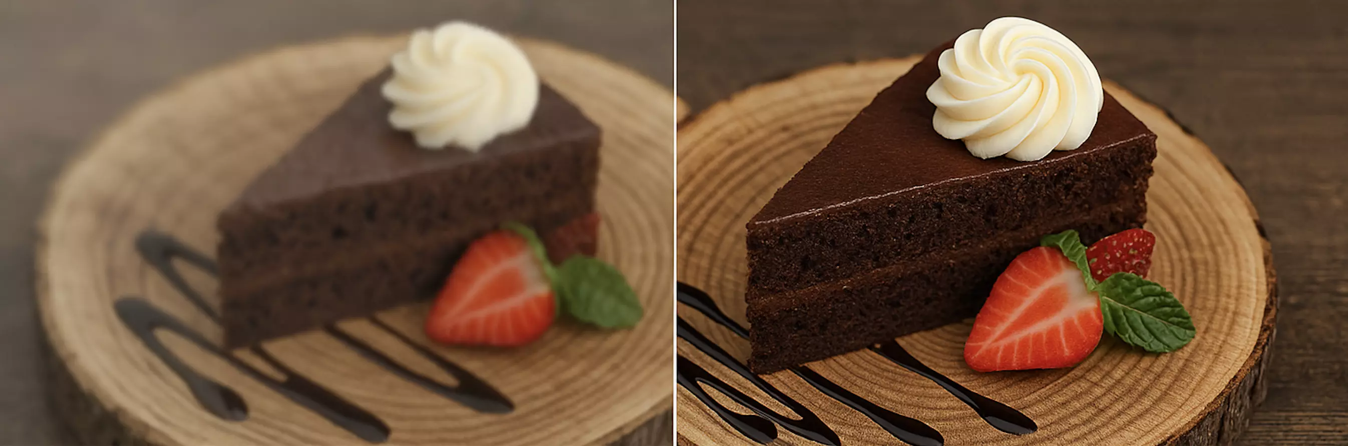
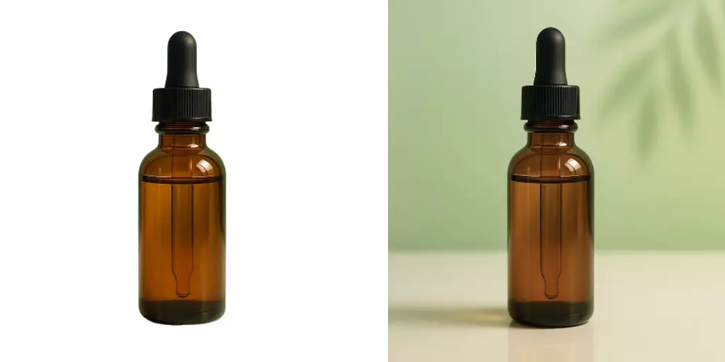
- Ceramic + Linen Vignette: A neutral-white background made beige linen look dull. Swapping to a clay orange added warmth; AI softening of shadows made ceramic edges feel rounded, not harsh. CTR on the collection page lifted after the thumbnail switch.
- Mid-Century Chair Hero: Burnt orange backdrop emphasized oak legs and leather grain. Removing a floor outlet and an unwanted cord with AI kept the scene premium without a reshoot.
- Seasonal Refresh: A brand shifted a spring “sand + white” palette to autumn “terracotta + brass” across 40 SKUs using batch background changes. No new props, just cohesive color—delivered in two days.
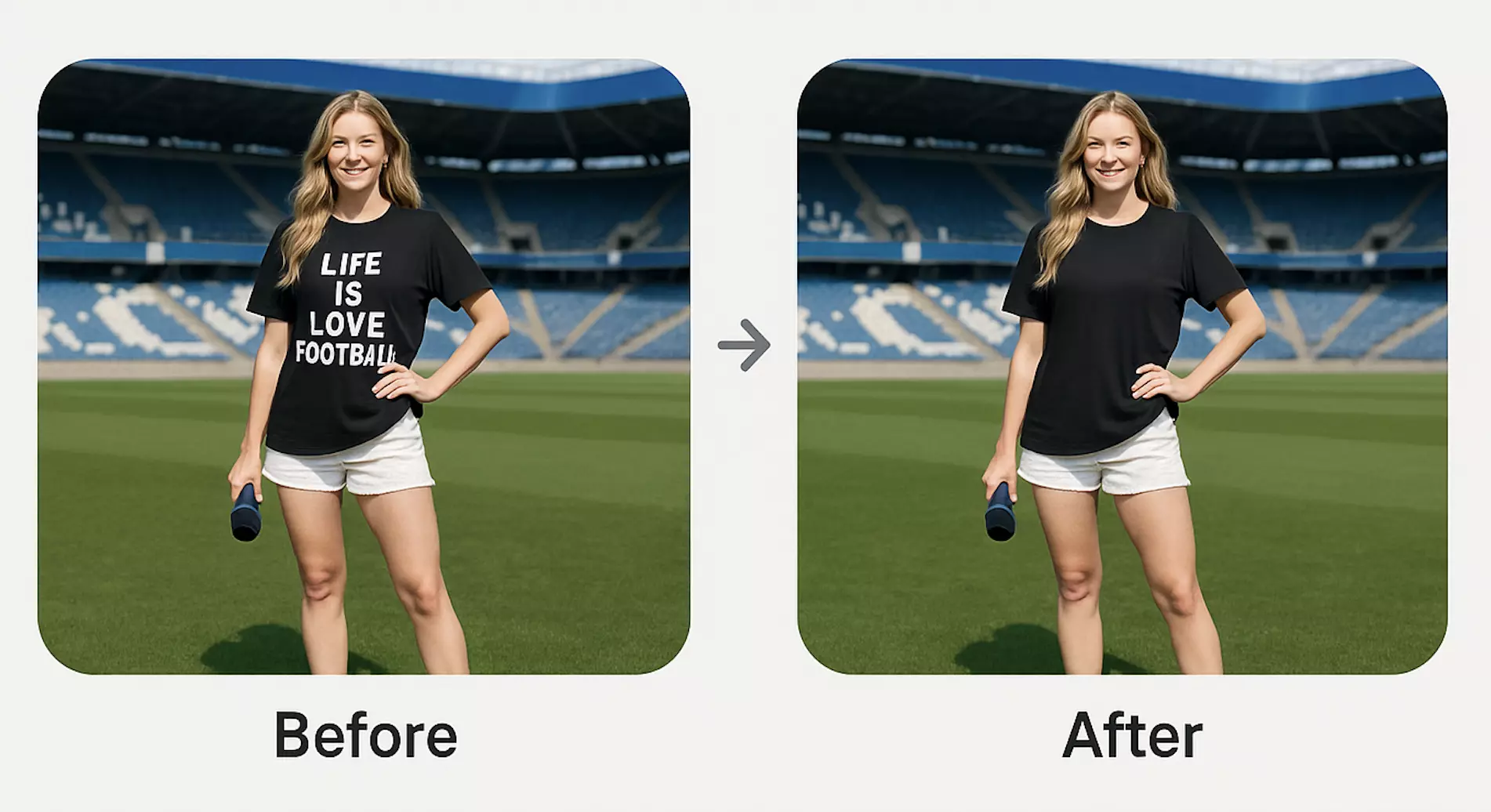
Reference comparison: (See image: side-by-side of the same decor vignette on neutral white vs warm orange background, showing mood and perceived warmth.)
AI Tools vs Traditional Methods
- Time cost: AI background editing trims hours of masking and retouching to minutes per shot; batch processing scales to entire collections.
- Learning curve: Pixflux.AI is click-and-preview simple, versus mastering complex layer workflows in pro software.
- Consistency: AI can generate identical hues and subtle texture across a series; manual repaints vary by batch and lighting changes.
- Budget: Minimize reshoots, set builds, and material waste; reserve studio time for hero campaigns.
- Collaboration: Designers, marketers, and photographers can align quickly around color options and export ratios without passing heavy files back and forth.
Traditional software still shines for deep compositing and pixel-level art direction, but for color-cohesive background changes, removal, generation, and small object cleanup, AI is faster and more repeatable.
Quality Control, Rights, and Responsible Editing
- Edge checks: Zoom to 200% for haloing around fine fibers and glass edges. Adjust edge softness if needed.
- Texture realism: Add light paper grain to orange gradients to prevent posterization on web and print.
- Color accuracy: Keep product neutrals neutral; the background can be warm, but highlights on reflective items shouldn’t shift orange.
- Rights and compliance: Only remove watermarks or logos from assets you own or have explicit permission to edit. Do not use background changes to misrepresent product color or features on marketplaces.
Troubleshooting Orange Backgrounds: Color Casts, Banding, Over‑Saturation
- Color casts on product edges: Increase subject–background distance in capture; in post, reduce background spill, then add a cool fill layer at low opacity to rebalance edges.
- Banding in gradients: Export at higher bit depth during editing; add 1–2% noise/grain; prefer WEBP or high-quality JPEG.
- Over-saturation: Drop saturation by 5–10 points, raise brightness slightly, and reintroduce warmth via midtone color balance rather than global saturation.
- Flat shadows: Move key light closer and enlarge the source for softer penumbra; in AI, decrease shadow hardness or add a subtle contact shadow under the subject.
FAQ: Orange Backgrounds for Home Decor Photography
Do orange backgrounds actually improve engagement for home decor?
Yes—warm orange tones increase perceived coziness and can improve click-through when used thoughtfully. Retailers report that saturated, cozy backdrops help thumbnails stand out in crowded grids, especially on mobile. Test A/B variants to validate impact for your audience and product category.
What hue and saturation should I choose for a tasteful orange background?
Aim for H 20°–40°, saturation 20%–55%, and brightness 65%–85% for a refined look. Terracotta and clay read artisanal and calm, while amber is brighter and sunlit. Keep enough luminance contrast between product and background to preserve clean edges and readable texture.
Which aspect ratios work best for Pinterest-style posts?
Use vertical 4:5 and 2:3; both outperform squares for discovery in 2026. Export at least 1500×2000 px (4:5) or 2000×3000 px (2:3), leave safe areas for overlays, and test text contrast against your chosen orange.
Can I remove watermarks or logos when editing backgrounds?
Only if you own the image or have explicit permission to edit and redistribute it. Watermark removal must not infringe copyrights or violate platform rules. Use these tools to clean your own assets or licensed images, not third-party content.
How do I avoid banding on smooth orange gradients?
Add subtle grain, keep higher bit depth during editing, and export with quality 80–90 or WEBP. Texture (paper, plaster) masks banding well, and slight noise helps gradients compress without visible steps.
Will an orange background distort my product’s color?
It shouldn’t if you control white balance and avoid warm spill onto the subject. Keep highlights neutral, shoot with distance from the backdrop, and in post reduce color contamination at edges. Calibrated monitors and sRGB exports help ensure consistent color.
Can I process a batch of images to keep the same orange tone?
Yes—batch processing ensures consistent hue and texture across a collection. Set your preferred orange once and apply to multiple SKUs, then run a quick visual pass to adjust edge softness and shadow intensity per image.
Conclusion and Next Steps
Warm orange backgrounds are more than a trend—they’re a practical tool to make interiors feel tactile and inviting across marketplaces and social feeds. With the right hue, soft shadows, and disciplined exports, you can refresh entire collections without building new sets. Pixflux.AI streamlines the heavy lifting: remove clutter, change or generate orange backgrounds, enhance details, and scale the look across SKUs with batch processing.
Ready to try it on your next vignette or furniture hero? Start with an orange background that fits your palette, preview variants, and ship web-ready images today.