Pink Background Aesthetic How to Build Community Through Comment Friendly Visuals
Want visuals that spark replies? See how a soft pink background signals warmth, plus get templates, contrast tips, and export presets for every social platform.
 Richard SullivanJanuary 12, 2026
Pink Background Aesthetic: How to Build Community with Comment‑Friendly Visuals
Your post looks great, the caption is clever—yet the comments are quiet. If your audience scrolls past because the design feels cold, cluttered, or hard to read, you’re leaving conversation on the table. In 2026, pastel palettes are everywhere for lifestyle, beauty, wellness, and creator brands—because they feel human. A soft pink background, in particular, signals warmth and approachability while staying modern and on‑brand. It can be the subtle design cue that invites people to reply, react, and join a thread.
The good news: you don’t need a big design team to make this work. With consistent templates, clear contrast rules, and lightweight AI tools, you can ship comment‑friendly visuals at scale. If you’re testing a pink background across posts, stories, and thumbnails, start with contrast‑safe hues and a repeatable layout that literally leaves space for conversation.
(See image: side‑by‑side mockups of soft pink background posts with high‑contrast text and visible comment threads.)
Why soft pink signals warmth and approachability
- Emotional tone: Soft pink reads as friendly, caring, and calm. It reduces perceived friction, which is ideal when you’re asking people to share an opinion or a story.
- Visual simplicity: A pastel pink background reduces visual noise, so the message and call‑to‑reply stand out.
- Cultural trend: Pastels continue to dominate social feeds in 2026, especially for lifestyle and creator brands, because they feel personal and non‑advertising.
When you want more replies, the first design job is to lower the “effort” your audience feels. Pink does this gently without sacrificing modernity.
Color psychology and accessibility basics for a pink background
Warmth without readability is a trap. To keep your soft pink aesthetic inclusive:
- Aim for WCAG AA contrast: 4.5:1 for body text and 3:1 for large text (18pt+ or 14pt bold).
- Prefer neutral dark text over pure black: Charcoal (#1A1A1A) or deep plum (#2A0F1F) often looks softer while still readable on pastel pink.
- Maintain consistent contrast across device modes: Test light and dark UIs; don’t rely on platform overlays to rescue low‑contrast text.
Accessibility is not just compliance—it’s engagement. If people can read your prompt quickly, they respond quickly.
Choosing the right pink: hex ranges, contrast ratios, and brand fit
Start with a hue that carries warmth but leaves room for text and stickers:
- Reliable soft pinks (backgrounds):
- Misty Rose: #FFE4E1
- Baby Pink: #FDE2E4
- Pale Pink: #FADADD
- Peach‑leaning Pink: #FFE3EC
- Accent‑friendly near‑neutrals:
- Blush: #F6DCE1
- Rosewater: #F9E5EA
Pairings that usually meet contrast easily:
- Text: #1A1A1A (charcoal), #2B2B2B (warm grey), or #3C2335 (deep plum)
- Outline/Buttons: #6D0031 (wine) or #0E1726 (ink)
How to evaluate a candidate:
- Place your long caption hook (100–140 characters) over the pink.
- Test body text at 14–16 px, and a CTA label at 18–22 px.
- Check color contrast with a WCAG tool (aim for AA or better).
- Try one accent color for highlights; keep it minimal.
Brand fit tip: If your brand already uses reds or corals, lean peachy (#FFD6E0) to avoid clashes; tech or productivity brands can choose cooler pinks with a slight violet tilt (#F3D6F9) for a modern edge.
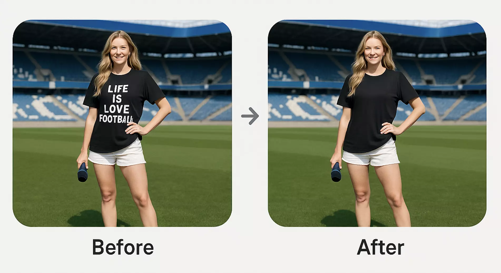
Comment‑friendly visuals: layouts that invite replies and threads
Structure your graphic so the comment action feels obvious and low‑effort:
- Top hook, mid content, bottom reply zone: Place the prompt question in the lower third so it sits near native comment UI on most platforms.
- Face + space: If you use a portrait, keep the subject to one side and leave clean pink space on the other for the question and reply sticker.
- Thread preview cues: Add a subtle “Your turn →” or “Add your take below” arrow pointing toward where the comments appear in‑app.
- Limit friction: Use one primary call to action—“Drop your #1 tip”, “Agree or disagree?”, “What did we miss?”
(See image: a soft pink background layout with a clear prompt in the lower third and visible comment thread cues.)
Template system: building consistent pink background social templates
To scale content across Instagram, TikTok, X, YouTube, and Pinterest:
- Define three core templates: 1) Question card 2) Quote + reply prompt 3) Carousel opener with a “Reply on slide 5” callout
- Lock typography: Font sizes, line heights, and max line length; prevent re‑wrapping issues.
- Reserve safe zones: Leave at least 10% padding around edges and a 15–20% clean area for the prompt.
- Color tokens: Save a primary pink (#FDE2E4), an alt pink (#FFE4E1), a text color (#1A1A1A), and an accent (#6D0031).
- Batch‑ready files: Keep background and subject on separate layers so you can quickly swap backgrounds or update prompts.
How to use Pixflux.AI to generate or change pink backgrounds in three steps
If you don’t have clean product shots or need to convert mixed assets into a unified look, an online AI tool makes it fast. With Pixflux.AI, you can remove complex backgrounds, generate a new pink canvas, and enhance clarity—no heavy software required.
1) Upload your image Import a portrait, product shot, or screenshot into Pixflux.AI.
2) Let the AI process the background Choose background removal, background change, or background generation. Pick or prompt a soft pink tone and preview.
3) Download the result Export the edited image and drop it into your social template or schedule it directly in your content workflow.
(See image: Pixflux.AI interface showing the three‑step flow: upload image, AI processing, and download result.)
If you’re starting from a blank template, try a soft pink background that already meets your contrast rules. Then layer your subject, add the prompt, and publish.
Pro workflow (five steps for extra control):
- Open Pixflux.AI and upload your original image.
- Select background removal to isolate your subject cleanly.
- Apply background generation; set a pastel pink with a slight gradient for depth.
- Preview result and fine‑tune: adjust intensity, add subtle noise, or deepen contrast.
- Download the final asset for your platform presets.
Notes:
- Use image enhancement to fix low‑light portraits before placing them on pink.
- If an older photo carries a watermark, use the watermark removal tool only when you own the rights or have explicit permission. Do not use watermark removal to bypass licenses or platform rules.
Safe contrast checklist: readable text, buttons, and stickers on pastel pink
- Body text meets 4.5:1 contrast (charcoal on #FDE2E4 often passes).
- Large headings meet 3:1 contrast and stay under 3 lines.
- CTA chips have at least 2 px inner padding and a stroke or shadow when placed on gradients.
- Stickers and emojis don’t replace key text; they should support, not carry, meaning.
- Test on mobile first: hold your phone at arm’s length and verify the prompt is readable at a glance.
(See image: soft pink background posts with high‑contrast text versus low‑contrast text, and visible comment threads.)
Cross‑platform export settings for Instagram, TikTok, X, YouTube, and Pinterest
- Square feed: 1080 × 1080 px, JPG or PNG
- Portrait feed: 1080 × 1350 px (max vertical real estate)
- Stories/Reels covers: 1080 × 1920 px; keep text within center‑safe zone
- TikTok
- Vertical video cover: 1080 × 1920 px
- Ensure the lower 20% is free for UI overlays; place the reply prompt just above that
- X (formerly Twitter)
- Feed image: 1600 × 900 px or 1200 × 675 px
- Keep the key text left‑centered; right edges may crop on some clients
- YouTube
- Thumbnail: 1280 × 720 px, 16:9, under 2 MB
- Use bolder text and higher contrast because thumbnails display small
- Standard pin: 1000 × 1500 px (2:3)
- Idea pin covers: 1080 × 1920 px
Export tips:
- PNG for graphics with text and flat color; JPG for photos to keep file sizes small.
- Add subtle grain (1–2%) to pink backgrounds to avoid banding after platform compression.
- Batch exports: Keep presets named by platform so anyone on the team can publish consistently.
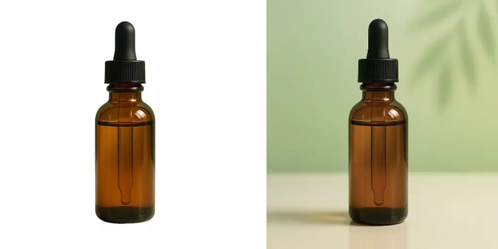
Case study: engagement uplift with pink background visuals
A mid‑sized wellness creator ran a four‑week A/B test across Instagram and TikTok:
- Setup: 40 posts—half using a cool grey background, half using a pastel pink background with the same copy and subjects.
- Process: Assets were standardized in Pixflux.AI—subjects cut out cleanly, distractions removed, and a consistent soft pink applied across all templates.
- Result: The pink background posts generated 23% more comments and 18% higher saves. The biggest gains appeared on question cards where the prompt sat in the lower third.
Why it worked:
- The soft pink lowered visual friction and emphasized the reply prompt.
- Clean isolation and enhancement kept faces crisp at small sizes.
- Consistency across posts trained the audience to recognize “this is the place to respond.”
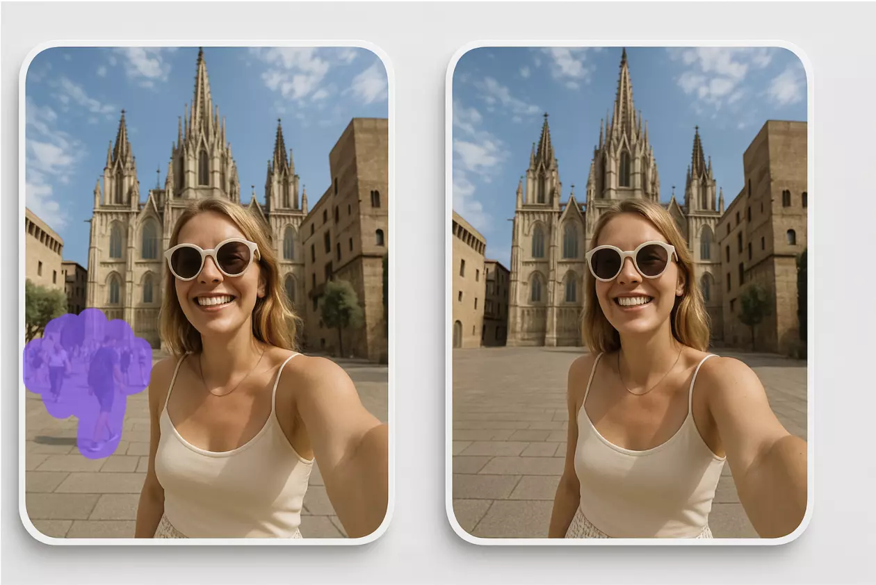
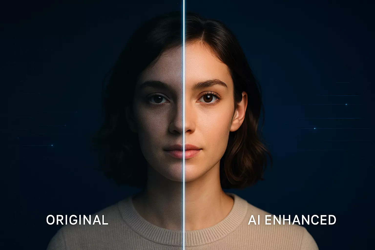
(See image: before/after pair where a product photo has its watermark removed and a new pastel pink background generated in Pixflux.AI.)
AI online tools vs. traditional methods
- Time cost
- Traditional: Manual masking, gradient building, and export prep can take 20–40 minutes per asset in desktop software.
- Pixflux.AI: Background removal, pink background generation, and export can take under a minute per asset—and you can batch similar images for even higher throughput.
- Learning curve
- Traditional: Requires pro‑level selection tools, layer effects, and color management know‑how.
- Pixflux.AI: Guided steps and visual previews let non‑designers hit publishable quality quickly.
- Batch efficiency
- Traditional: Actions and scripts help but still require oversight and cleanup.
- Pixflux.AI: Batch upload product shots or portraits, remove clutter, apply a uniform pastel pink, and download ready‑to‑use files.
- Cross‑team adaptability
- Traditional: File handing can be blocked by missing fonts, versions, or heavy project files.
- Pixflux.AI: Lightweight assets and consistent outputs make it easy for creators, marketers, and community managers to pick up and post without bottlenecks.
If you’re moving fast and want to ship more conversation‑ready posts per week, an AI tool streamlines the last‑mile production without sacrificing quality.
Workflow extras: object cleanup and polish
- Distraction removal: Clear stray cables, photobombers, or background clutter so the subject and the prompt remain the focus.
- Watermark and logo cleanup: Use Pixflux.AI carefully to remove marks from your own assets or with permission. Always respect copyright and platform policies.
- Enhancement: Slightly boost clarity and contrast on the subject so they stand out against a pastel pink background.
Quick starter pack: what to standardize this week
- One brand‑approved pink (#FDE2E4) + one alt pink (#FFE4E1)
- Two text colors: #1A1A1A for body, #2B2B2B for large headings
- Three templates: Question card, Quote + reply, Carousel opener
- One export preset per platform
- A Pixflux.AI routine: remove background → generate pink → enhance → export
When you’re ready to systemize, open your template, drag in a subject, and use Pixflux.AI to keep the look consistent post after post. If needed, start from a pastel pink background to accelerate layout creation across sizes.
FAQ: pink background aesthetic, readability, formats, and workflow
What hex codes work best for a soft, readable pink background?
Start with #FDE2E4 or #FFE4E1 for reliable readability. These hues are light enough for warmth yet soft enough to keep text legible with a charcoal overlay. If your text is very small, consider slightly deepening the pink (e.g., #F9DDE2) or darkening the text color to maintain WCAG AA contrast.
How do I make sure my text passes accessibility on pastel pink?
Aim for 4.5:1 contrast for body text and 3:1 for large text. Use a contrast checker on your chosen pink and text colors. Increase font size or weight for borderline cases, and add a subtle shadow or stroke only if needed—contrast should primarily come from color choice, not effects.
Can I use gradients or textures on a pink background without hurting readability?
Yes, as long as the text sits on a stable, contrast‑safe area. Keep gradients extremely soft and avoid crossing text over hue or value shifts. A micro‑texture or 1–2% grain can help reduce banding after compression while keeping text clear.
What file formats should I export for social platforms?
Use PNG for text‑heavy graphics and JPG for photos or mixed content. PNG preserves crisp edges and flat colors on pastel backgrounds. For photos, high‑quality JPG keeps file sizes smaller. Always test a compressed preview to ensure your pink doesn’t band or your text doesn’t soften.
How can I quickly switch a photo’s cluttered scene to a clean pink background?
Remove the background and apply a new pink canvas in an online AI tool. In Pixflux.AI, upload your image, remove or change the background, and select a soft pink tone. Preview, adjust, and download. This keeps your subject consistent while aligning every post with your pink aesthetic.
Is it okay to remove watermarks when repurposing content?
Only remove watermarks when you own the rights or have explicit permission. Watermark removal should never be used to bypass licensing or platform rules. Use Pixflux.AI’s cleanup features for your own assets, approved collaborations, or when you’ve obtained written consent.
How do I maintain consistency across a team posting on multiple channels?
Standardize templates, color tokens, and export presets—and keep assets lightweight. Set one primary and one alt pink, lock text styles, and create platform‑specific export sizes. Use a consistent Pixflux.AI workflow to remove backgrounds, generate pink canvases, and enhance images so every team member can produce matching outputs.
What if my audience skews more tech or masculine—will pink still work?
Use cooler pinks or mix with neutral accents to maintain brand fit. A violet‑tinted pink (#F3D6F9) paired with charcoal and slate accents feels modern and gender‑neutral. Keep the same readability rules and friendly layout that encourage replies.
Conclusion and next steps
Community grows where visuals feel human and easy to engage with. A soft pink background lowers friction, highlights your prompt, and sets a consistent visual signal for “this is a conversation.” Combine contrast‑aware color choices with a simple template system and a lightweight production workflow, and you’ll ship more posts that invite replies—without adding design debt.
Ready to try it? Start with a contrast‑safe soft pink background, then use Pixflux.AI to remove clutter, generate a clean pastel canvas, enhance your subject, and export for every platform. Publish your next conversation‑starter today.