How Creative Brands Use Purple Background Images to Make Product Campaigns Feel More Distinctive
See how purple backgrounds make products feel premium and expressive—plus simple steps to create them with Pixflux.AI for ads, launches, and social.
 Richard SullivanMarch 9, 2026
How Creative Brands Use Purple Background Images to Make Product Campaigns More Distinctive
In a crowded feed where endless product shots scroll past at speed, it’s hard to make an impression without shouting. Many teams default to white or gray backdrops for safety—then wonder why click-throughs stall and social thumbs keep swiping. If your brand feels stuck in “safe but same,” experimenting with purple background images can create the mood shift your products need to stand out without compromising clarity or conversion.
Bold color blocks are proven to stop the scroll in social commerce. Purple is especially effective because it signals premium, imagination, and modernity—qualities product teams want for launches, ads, and hero visuals. You don’t need to overhaul your brand to try it. With modern AI editors, you can test and iterate fast, from quick swaps for a single asset to entire collections rendered on cohesive purple background images.
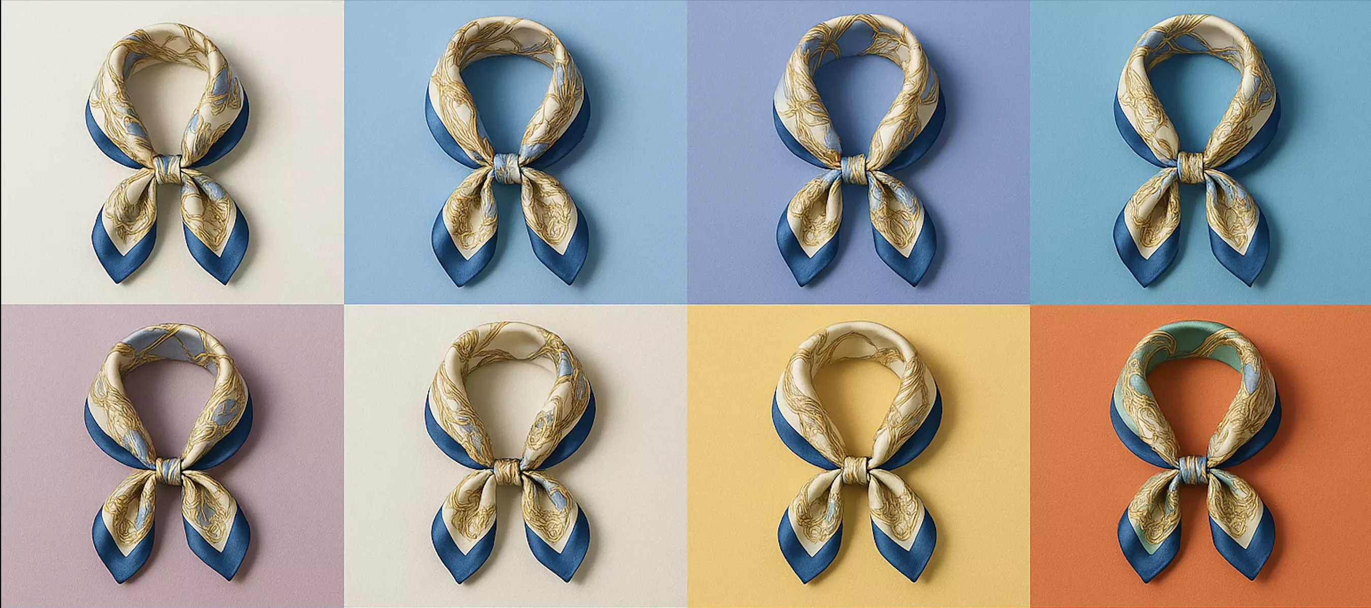
(See image: Grid of campaign crops using deep violet, lavender, and gradient purple backgrounds with contrast overlays for text and logo legibility.)
Why purple backgrounds help brands look more distinctive
Purple is unusually flexible in product campaigns. On one axis, it can tilt regal and luxurious; on another, futuristic and creative. That range lets creative teams adapt the tone to the category—deep violet for a “premium” fragrance launch, bright lavender for playful DTC accessories.
Just as important, purple is relatively underused as a default product backdrop compared with white, black, or beige. That makes it a strong visual differentiator in marketplaces, Instagram carousels, TikTok Shop thumbnails, and landing-page hero sections. The color alone isn’t a strategy, but it’s a reliable way to frame your product as expressive and modern.
Color psychology of purple: premium, creativity, and trust cues
- Premium: Historically associated with luxury, deep purples (e.g., royal purple, eggplant) cue quality and exclusivity.
- Creativity and innovation: Brighter, electric purples feel experimental and tech-forward, ideal for gadgets, creator tools, or gaming accessories.
- Calm confidence: Pastel and lavender tones read soft and calming for wellness, skincare, and lifestyle brands.
The takeaway: adjust the hue and brightness to match your brand voice. A luxury label might lean into darker, saturated purples; a playful DTC brand could use lighter lavender with soft gradients.
When to use purple backgrounds for product photos and ads
- Social campaigns: Stop-the-scroll tiles, reels covers, and carousels where a bold field of purple draws the eye, especially on mobile.
- Product launches: Limited editions, collabs, and seasonal drops; purple helps set a distinct “chapter” in your visual story.
- Ad variants: A/B tests across Meta, TikTok, and YouTube thumbnails; use purple as the differentiator while keeping product angle and copy consistent.
- Branded content: Editorial blog headers, lookbooks, and email hero banners where a purple frame ties assets back to your palette system.
- Marketplaces: As secondary images that highlight features or materials—always check each platform’s image guidelines for background color allowances.
Design principles: make purple work for contrast, legibility, and accessibility
- Start with contrast: Aim for at least a 4.5:1 contrast ratio when placing text or UI elements over purple. White usually reads clean on deep purple; charcoal or near-black is safer on lavender.
- Control luminance, not just hue: Two purples with the same hue can perform very differently depending on brightness. Darken the backdrop until the product edges are unmistakable.
- Keep edges natural: Maintain soft, realistic shadows and light falloff so the product doesn’t look “stickered” on top of the background.
- Use gradients and noise wisps sparingly: Subtle radial or linear gradients can add depth, but aggressive gradients may cause banding on some displays—add a touch of fine noise to reduce it.
- Respect brand elements: Keep a safe zone for your logo or badges; test a pill-shaped high-contrast chip behind small text if the purple varies across gradients.
Production paths: studio seamless vs. AI-generated purple backgrounds
- Studio seamless: Purple paper rolls and gelled lights create excellent results but require setup time, controlled lighting, and physical space. They’re great for hero shoots and when your team has a lighting pro.
- AI-generated backgrounds: Ideal for fast iteration and consistent looks across many SKUs without a studio day. AI tools can remove cluttered environments, apply a uniform purple background, and generate nuanced gradients or textures that match your brand system.
Most teams today mix both: shoot clean key visuals in studio and extend the campaign set with AI backgrounds for speed and channel fit.
How to change or generate purple backgrounds with Pixflux.AI in three steps
AI editors make it surprisingly simple to switch any product shot to a clean purple background—no advanced retouching required. For example, Pixflux.AI lets you remove the existing environment, generate purple backgrounds, tidy edges, and download final assets at speed.
- Upload your source image
- Drop in a product photo from your camera roll, marketplace library, or studio export—cluttered backgrounds are fine.
- Let the AI process the image
- Use background removal to isolate the product, then choose a purple backdrop. You can dial in a solid hue, soft gradient, or a brand-appropriate texture. If needed, enhance clarity and contrast so materials read accurately.
- Download the result
- Preview the edges and shadow realism, make small adjustments, then export in the size and format you need for ads or ecommerce.
Tip: For hands-on practice, use a sample shot and create attention-grabbing purple background images. You’ll see how different hues (deep violet vs. lavender) change the product’s perceived price point and mood.
(See image: Pixflux.AI interface showing the 3-step flow: upload image → AI processing → download result for changing a product photo to a purple background.)
Batch your catalog: consistent purple product backgrounds at scale
Campaigns rarely need just one asset. When you’re rolling out a launch or refreshing a category page, consistency is everything. Pixflux.AI supports bulk uploads and multi-image processing so you can:
- Remove busy scenes and apply a uniform purple look across dozens of SKUs
- Keep shadows consistent and edges clean from image to image
- Save preferred purple hues or background templates for repeatable results
This is where brand systems extend from color swatches to operational output. A single, defined purple family—say, Deep Violet for hero tiles and Lavender Mist for secondary shots—keeps your catalog coherent across markets and channels.
Quality checks for purple background images: banding, edges, noise, and exports
Before you ship assets to your CMS or ad platforms, run these checks:
- Banding on gradients: If you see visible steps in a gradient, add a touch of fine noise/dither, slightly adjust the gradient angle, or export at higher bit depth where supported.
- Clean edges, real shadows: Zoom to 200% to inspect hairlines and textured materials. Keep a faint contact shadow; avoid haloing that makes products float unnaturally.
- Color accuracy: Purple can reflect onto glossy surfaces; add a subtle warm fill or reduce saturation in the reflection area so the product color remains true.
- Compression noise: Export web images at a balance of sharpness and size; overly aggressive compression can wash details or create blocky artifacts on gradients.
- Marketplace specs: For Amazon, Etsy, eBay, and similar, ensure your export meets pixel dimensions, file format, and background rules for each listing type. Purple often works well as a secondary image or A+ detail tile—verify per platform.
Before–after examples: what changes when you go purple
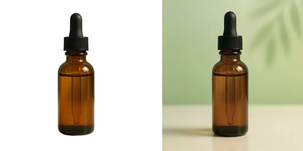
- Beauty: A serum bottle shot in a cluttered bathroom becomes a sleek product hero on a deep purple field with a soft radial glow. The glass catches light better, and the dropper silhouette reads instantly.
- Tech accessories: Cables and chargers pop against lavender, with legible white label overlays for specs. The lighter purple frames small components without visual noise.
- Home goods: Matte ceramic tableware benefits from a rich, desaturated purple, which gives enough contrast without overpowering earth tones.
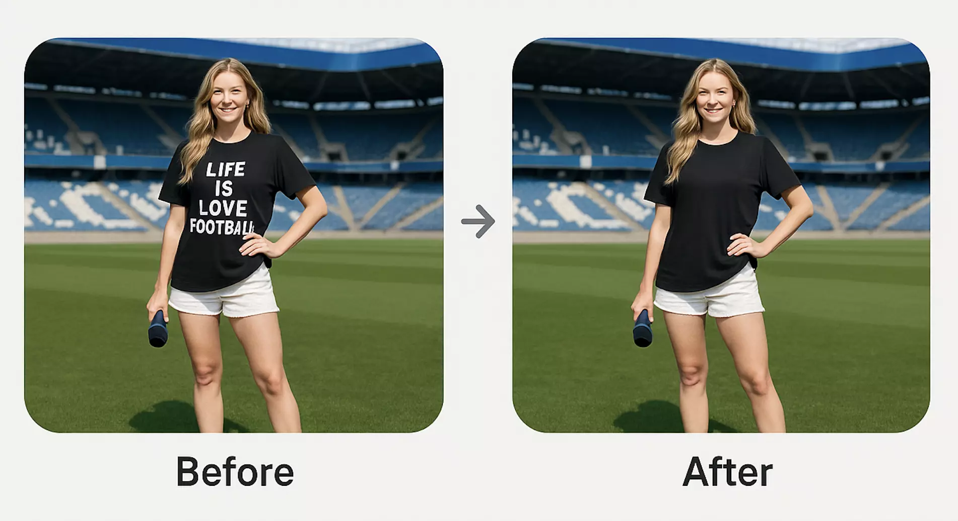
(See image: Before-and-after product photo—cluttered scene versus clean purple background generated with Pixflux.AI, highlighting edge quality and shadow realism.)
Legal, watermark, and brand safety: do it right
AI can also remove watermarks or stray logos from your own images, but always respect rights and platform rules. Only edit media you own or have explicit permission to modify. Using watermark removal to bypass licensing terms or misrepresent ownership is prohibited and can trigger account or legal issues.
Similarly, keep claims and regulatory marks accurate. If you overlay badges or text on purple backgrounds (e.g., “vegan,” “wireless,” “FDA-cleared”), ensure they are compliant for each market and channel.
AI tools vs. traditional methods
- Time cost
- Traditional: Scheduling studio days or manually masking in desktop software can take hours per image, especially for complex edges (hair, textiles, chrome).
- AI tools like Pixflux.AI: Minutes end-to-end, even for large batches, with high-quality background removal, purple background generation, and edge refinement.
- Learning curve
- Traditional: Pro-level results require deep knowledge of selections, curves, dodge/burn, and color management.
- AI: Intuitive workflows lower the barrier so marketers and creators can produce on-brand visuals without heavy retouching skills.
- Batch efficiency
- Traditional: Scripting and actions help but still need setup and manual QA.
- AI: Bulk upload and consistent presets keep catalogs aligned across SKUs and campaigns with less repetitive work.
- Cross-team adaptability
- Traditional: Files and instructions often bottleneck with a single specialist.
- AI: Anyone on the campaign can quickly swap variants (lavender for Spring, deep violet for Holiday), freeing designers to focus on higher-impact creative.
Pro tips for getting the purple “just right”
- Test multiple hues side-by-side: Run an A/B/C with dark, mid, and light purple to see which drives higher CTR or add-to-cart.
- Match brand palette codes: If you have defined HEX or Pantone values, align generated backgrounds to those for consistency across print and digital.
- Add depth with restraint: A subtle radial gradient centered behind the product lifts it from the background without stealing attention.
- Keep accessibility in mind: If you place text on purple, try white with a thin dark outline or a semi-opaque pill behind small copy.
FAQ: Purple background images for ecommerce and social campaigns
Do purple backgrounds convert as well as white?
Yes—when contrast and product clarity are optimized, purple can match or outperform white. Teams often see stronger thumb-stopping rates on social and better visual hierarchy on PDP galleries when purple is used for secondary images. Ensure the product remains color-accurate and text is legible against the background.
Will marketplaces allow purple backgrounds on product images?
Usually for secondary images, but check each platform’s rules for main images. Many marketplaces require pure white for the primary image but permit colored or lifestyle backgrounds for additional slots. Review current requirements before uploading and reserve purple for gallery images where permitted.
How do I pick the right shade of purple for my brand?
Choose a hue that aligns with your palette and meets contrast goals for the product. Deep violets communicate premium; lavender feels soft and approachable. Test 2–3 tones with your hero SKU and evaluate edge clarity, material rendering, and how your logo reads on top.
Can I batch edit a full catalog to purple backgrounds?
Yes—use bulk upload and one-click processing to stay consistent across SKUs. Upload multiple assets, apply the same purple template or hue, and review edge quality before exporting. This is where AI tools shine by reducing manual repetition while keeping shadows and tone uniform.
How do I avoid banding on purple gradients?
Add subtle noise/dither and export at higher quality settings. Banding shows up as visible steps in a gradient; a small amount of fine-grain noise breaks up those steps. Also avoid overly compressed exports; if possible, render gradients slightly darker to maintain smoothness.
Will a purple background distort my product’s color?
It can influence reflections, so manage lighting and saturation carefully. Glossy surfaces may pick up a purple tint. Use realistic shadows, reduce saturation in reflective areas, or slightly warm highlights to preserve true product color. Always compare against a color-calibrated reference image.
Is watermark removal legal for my campaign assets?
Only if you own the rights or have explicit permission to edit the image. Use watermark and logo removal ethically to clean your own assets or licensed media. Do not remove third-party marks to bypass licensing or platform policies.
Your quick-start checklist for purple background success
- Define 1–2 brand-approved purples (hero + secondary)
- Check contrast and readability for product and overlay text
- Choose production: studio seamless for hero shots, AI for speed and variants
- Batch process SKUs and QA edges, shadows, and banding
- Export to platform specs and run creative A/B tests
Try it now: turn any product shot into a distinctive purple hero
Purple can be your differentiator—tasteful, premium, and unmistakably you. In minutes, you can remove clutter, generate on-brand backdrops, and ship assets that look like a campaign, not a patchwork. Turn a test image into a standout tile today with Pixflux.AI and switch your shot to a clean purple background. If you’re ready to refresh a whole collection, build consistent purple product backgrounds across your catalog and speed up content for launches, ads, and social—without adding production days.