Transparent PNG Overlays for Creators Build Reusable Title Cards and Frames
Turn one overlay into a whole brand system—frames, labels, CTAs—with readable type across thumbnails and covers. Plus, fast transparent background edits.
 Sierra CappelenMarch 5, 2026
Transparent PNG Overlays for Creators: Build Reusable Title Cards and Frames
If your thumbnails, covers, and posts look different every week, your audience spends precious seconds re-learning who you are instead of focusing on your message. Creators who standardize visual systems—frames, lower-thirds, CTA badges—see faster recognition, cleaner feeds, and more consistent click-through behavior across platforms.
The fastest way to standardize is to separate content from design. That means building a small library of transparent PNG overlays you can drag onto any image or video frame. Start with clean subject cutouts and a reliable transparent background workflow so your overlay elements sit neatly above any photo without clashing. In this guide, we’ll walk through core transparency concepts, how to plan a reusable overlay system, and how to generate production-ready assets with Pixflux.AI.
(See image: Grid of reusable PNG overlays on a checkerboard background—frames, corner badges, and lower-thirds)
Why transparent PNG overlays elevate creator branding
- Consistency without redesigns: One overlay library scales across thumbnails, Shorts, Reels, Stories, and podcast art.
- Faster production: Drag-and-drop frames, labels, and badges mean less fiddling with styles on deadline.
- Accessibility wins: Pre-tested contrast and type treatments keep text readable across busy imagery.
- Platform agility: Transparent PNGs are lightweight, travel well, and maintain alpha channels when exported correctly—ideal for short-form platforms that reward fast loading.
Transparency essentials: PNG-24 vs PNG-8, alpha channels, and antialiasing
- Alpha channels: Transparency is not just “no color.” It’s an 8-bit channel controlling per-pixel opacity, enabling smooth edges and soft shadows around text, logos, and cutouts.
- PNG-24 vs PNG-8:
- PNG-24 supports millions of colors plus full alpha transparency—best for overlays with gradients, antialiased curves, or semi-transparent strokes.
- PNG-8 limits color depth and often uses binary transparency; it’s smaller but can create banding and halo artifacts.
- Antialiasing: Your type edges and shapes should be antialiased for smoothness. On transparent edges, poor antialiasing causes fringes (light or dark halos). Always preview overlays on both light and dark backgrounds before export.
Plan a reusable overlay system
Think in modular building blocks that you can stack, snap, or toggle:
- Frames: Border treatments that unify your brand. Use consistent corner radii, stroke weight, and inner padding.
- Lower-thirds: A semi-transparent strip or shaped panel for titles, guest names, or episode numbers. Define maximum line length and safe areas.
- Labels and CTA badges: “New,” “Live,” “Guide,” or “Free preset” badges. Opt for vector-first designs and export as PNGs only at final sizes.
- Iconography: Lock up icons with text (e.g., play button + “Watch Now”). Maintain consistent stroke style.
- Safe zones and margins: Decide the minimum gutter from frame edges to any text or badge to prevent platform UI overlaps (e.g., time stamps or like/share icons).
Tip: Document your overlay kit like a mini design system—naming conventions (frame/blue/1080), color tokens (brand-primary-600), and sizes for major platforms.
Typography on a transparent background: readability first
Readable type should survive busy photos, not just studio shots:
- Contrast: Use light-on-dark or dark-on-light consistently. Consider semi-transparent panels (e.g., black at 40–60% opacity) behind type to stabilize legibility.
- Strokes and shadows: A 1–2 px outer stroke or a soft drop shadow (10–20% opacity, short offset) helps on mixed backgrounds.
- Safe areas: Keep titles away from the top-right and bottom regions that platforms overlay with UI. Test across YouTube, Instagram, and TikTok frames.
- Hierarchy: Define font sizes and weights for title, subtitle, and metadata (episode number, duration). Don’t let badges overpower the title.
Color, material, and blend-mode choices that travel
- Brand color tokens: Pick 2–3 core hues plus a neutral. Test each on light, mid-tone, and dark photos.
- Materials: Use subtle glassmorphism (blur + translucent panels) or flat solids—but be consistent.
- Blend modes carefully: Multiply, Screen, or Overlay can create unexpected shifts across photos. For overlays you’ll reuse everywhere, standard opacity + solid colors are safer and more predictable than blend modes.
How to design a transparent PNG overlay in common editors
You can create overlays in any design tool (Figma, Photoshop, Affinity, Sketch, or Canva). The workflow is similar:
- Create a canvas at the largest size you need (e.g., 1920×1080 for video frames).
- Design your elements on separate layers: frame, lower-third panel, title, badge.
- Hide or delete placeholder photography layers so your canvas background is transparent.
- Export overlays as PNG-24 with transparency enabled. Save each module separately (e.g., frame-only, lower-third-only).
- Test each overlay on a set of sample photos: bright, dark, high contrast, low contrast.
Pro tip: Maintain a master file with symbols/components. When you tweak a stroke width or corner radius, all overlays update at once.
Build clean transparent overlays with Pixflux.AI
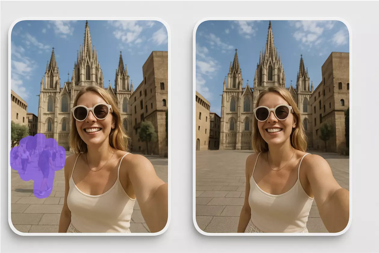
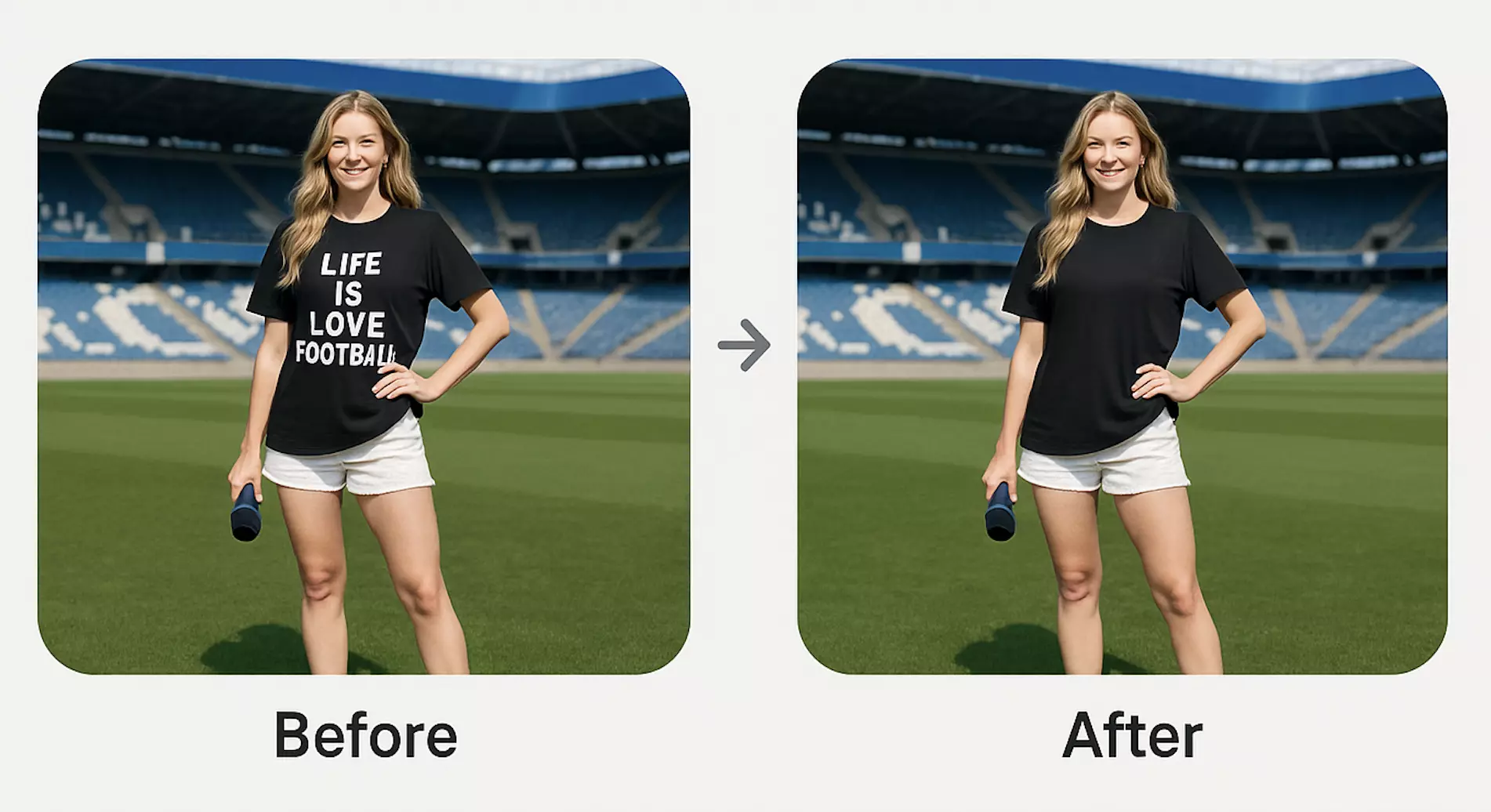
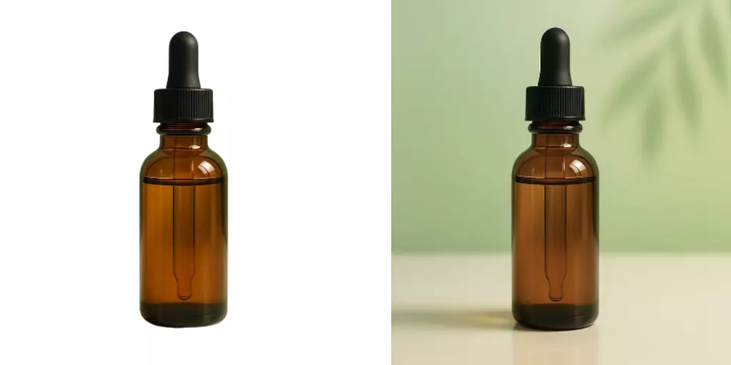
When your overlay uses a cutout subject, or you need to clean edges, remove clutter, or fix halos fast, Pixflux.AI saves hours. It handles background removal, background replacement, object cleanup, watermark removal, and detail enhancement—including batch runs when you’re prepping a season’s worth of thumbnails.
Follow this 5-step flow to make background transparent and prepare overlay-ready subject layers:
- Open the Pixflux.AI transparent background tool.
- Upload your source image (portrait, product, or scene).
- Choose the background removal tool and let the AI isolate the subject. Optionally remove stray objects or watermarks and enhance clarity.
- Preview the edge quality on both light and dark checkers; refine with softening or edge-restore if needed.
- Download the transparent PNG and place it beneath your overlay frame or lower-third in your editor.
(See image: Screenshot sequence of the Pixflux.AI interface showing Upload → AI process → Download steps)
Extra tips with Pixflux.AI:
- Clean halos around hair or glass by toggling fine-edge recovery.
- For busy locations, remove distractions (wires, passerby) before export so your type remains readable.
- If you need a consistent scene, swap or generate a simple branded background, then sit your overlays on top for a “studio” look.
- Use batch processing to prepare a full set of cutouts for a series or product line in one sitting.
Compliance note: Only remove watermarks or logos from images you own or have explicit permission to edit. Do not use watermark removal to bypass copyright or platform rules.
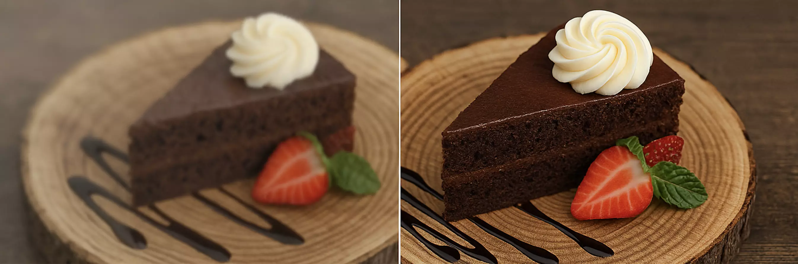
(See image: Before-and-after comparison—busy product photo vs clean subject cutout on a transparent background using Pixflux.AI)
Export and compression: keep it crisp and lightweight
- PNG-24 for overlays: Preserve alpha channels and subtle shadows.
- File-size budgets: Keep key overlays under ~300 KB where possible; badges often under 50–100 KB.
- Retina and scaling: Export at 2× for sharp UI overlays on high-density screens, but test loading times.
- Artifact checks: Zoom to 200–300% on edges and compare on dark vs light backgrounds to spot fringing before publishing.
Batch variations for major platforms
Design once, export many:
- YouTube thumbnails: 1280×720 (16:9). Keep title in the left or center-left for Western languages; avoid bottom-right where timestamps sit.
- Shorts/Reels/Stories: 1080×1920 (9:16). Anticipate in-app UI overlays at top/bottom—elevate type to the upper-middle safe zone.
- Square posts: 1080×1080. Simplify badges; reduce line lengths to avoid wrapping.
- Podcast covers: 3000×3000 when possible for platform quality gates; backfill to 1400×1400 if needed.
Create size-specific exports of your overlays so geometry and type scale proportionally rather than relying on auto-scaling each time.
Quality control and accessibility
- Legibility tests: Run quick passes on light, dark, and mid-tone images. If type fails on any, adjust panel opacity or add a stroke.
- Safe margins: Stick to your predefined gutters; keep critical text away from corners.
- Color contrast: Aim for WCAG-like contrast thinking—even though you’re working with images—not every viewer watches on a bright screen.
- Watermark checks: Ensure any visible marks (brand bugs you do not control) are cleared responsibly with Pixflux.AI before export, subject to permissions.
Case study snapshot: overlay systems improve clarity
Creators who adopt overlay systems report clearer messaging and faster production cycles. A consistent frame and lower-third structure reduces on-thumbnails decision-making to seconds: pick a background/cutout, drop in the overlay, update the title, export. The result is a recognizable presence across YouTube and short-form feeds, fewer legibility issues on mobile, and a smoother publishing pipeline for teams and solo creators alike.
AI online tools vs traditional methods
- Time to value:
- Pixflux.AI and similar online tools give you clean subject cutouts, clutter removal, and enhancements in minutes.
- Traditional software can deliver exceptional results but often requires advanced masking skills and more manual cleanup.
- Learning curve:
- Online tools are point-and-click; they’re easy to hand off to collaborators with varied skill levels.
- Desktop suites demand deeper knowledge of masks, channels, and export settings.
- Batch efficiency:
- Pixflux.AI handles batch background removal and cleanup, ideal for series-based content and product drops.
- Manual processing or outsourcing introduces delays, back-and-forth revisions, and higher costs per image.
- Cross-team alignment:
- A shared overlay folder plus simple online cutouts keeps editors, social managers, and designers in sync without lengthy tutorials.
FAQ: Transparent background overlays
What format should I use for overlays with transparency?
Use PNG-24 for overlays that need smooth edges and semi-transparent elements. PNG-24 preserves full alpha channels, which keeps strokes, soft shadows, and antialiased text clean over any background. PNG-8 can be smaller but often introduces banding and hard transparency, which hurts readability and polish.
How do I avoid halos or color fringing around text and cutouts?
Refine edges and preview on both light and dark checkers before export. Halos appear when background colors leak into antialiased edges. With Pixflux.AI, re-run fine-edge recovery or slightly contract/feather the selection. In editors, add a subtle stroke matched to the intended background (dark or light) to mask residual fringing.
Can I batch-create overlays for different platforms?
Yes, build size-specific versions and export them in a single session. Create master components for 16:9, 9:16, and 1:1, then export your overlays in sets. When prepping cutout subjects, Pixflux.AI’s batch processing accelerates consistent results across your entire series.
Will transparent PNGs stay crisp on mobile and retina screens?
They will if you export at appropriate scales and budgets. Export at 2× when text or thin strokes look soft on dense displays. Keep file sizes under control by avoiding unnecessary gradients or oversized canvases. Always test on a real phone lock-screen brightness and in dark mode.
What’s the best way to keep type readable over busy photos?
Use contrast helpers like semi-transparent panels, strokes, or drop shadows. Decide on a consistent treatment—e.g., 50% black panel + 1 px outer stroke—and bake it into your overlay library. Test on three background sets (light, dark, saturated) before publishing.
Is it okay to remove watermarks or logos when building overlays?
Only if you own the content or have explicit permission. Use watermark removal to clean your own assets or licensed images, not to bypass rights or platform policies. When in doubt, keep the mark or replace the asset with a licensed version.
How do I keep file sizes small without losing quality?
Prefer flat colors, limit large blurs, and export PNG-24 only where needed. For tiny badges, consider simplifying gradients. Double-check that you’re not exporting full-canvas transparency when a tighter trim reduces bytes.
Reference images to include
- (See image: Screenshot sequence of the Pixflux.AI interface showing Upload → AI process → Download steps)
- (See image: Grid of reusable PNG overlays on a checkerboard background—frames, corner badges, and lower-thirds)
- (See image: Before-and-after comparison—busy product photo vs clean subject cutout on a transparent background using Pixflux.AI)
Conclusion and next steps
A small, well-documented overlay system turns design chaos into a repeatable, brand-first workflow. With clean cutouts, readable type, and size-specific exports, your thumbnails and covers travel cleanly across platforms while staying lightweight for short-form feeds. When you’re ready to build your kit or refresh edge quality across a back catalog, start with a solid PNG transparent background process via Pixflux.AI—upload, let the AI clean the edges, and download assets that drop straight into your overlays.