Sustainable Fashion Visuals Use Gold Backgrounds to Add Warmth Without Greenwashing
Gold adds warmth to eco-fashion without the greenwash—see color tips, lighting, a Pixflux.AI how-to, and a caption-proof checklist you can deploy today.
 Emily CremerJanuary 12, 2026
Sustainable Fashion Visuals: Use a Gold Background to Add Warmth Without Greenwashing
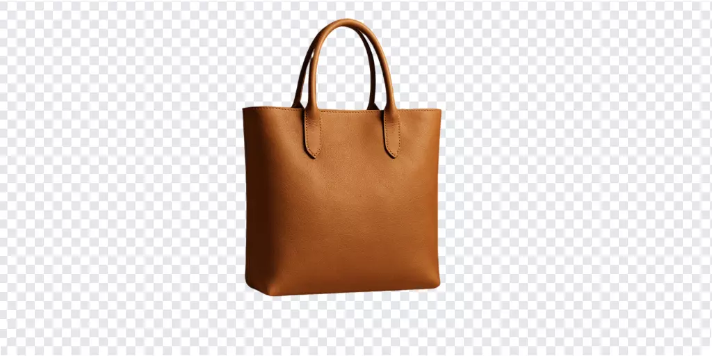
Sustainable fashion brands walk a tightrope. Go too minimal and your product images feel clinical; go too earthy and you risk cliché. Meanwhile, audiences punish anything that looks like greenwashing. The result is a common pain point: how do you create warm, premium-feeling visuals that communicate craft and care—without overstating environmental claims?
A subtle gold background can be the bridge. Gold tones add warmth and an artisanal vibe that aligns with natural fibers, recycled metals, and slow-fashion values. The trick is doing it with restraint: low saturation, honest textures, and captions that back up your story with proof. AI editing tools like Pixflux.AI make this test-and-learn approach practical by letting teams quickly try variations of gold backgrounds and keep the look consistent at scale.
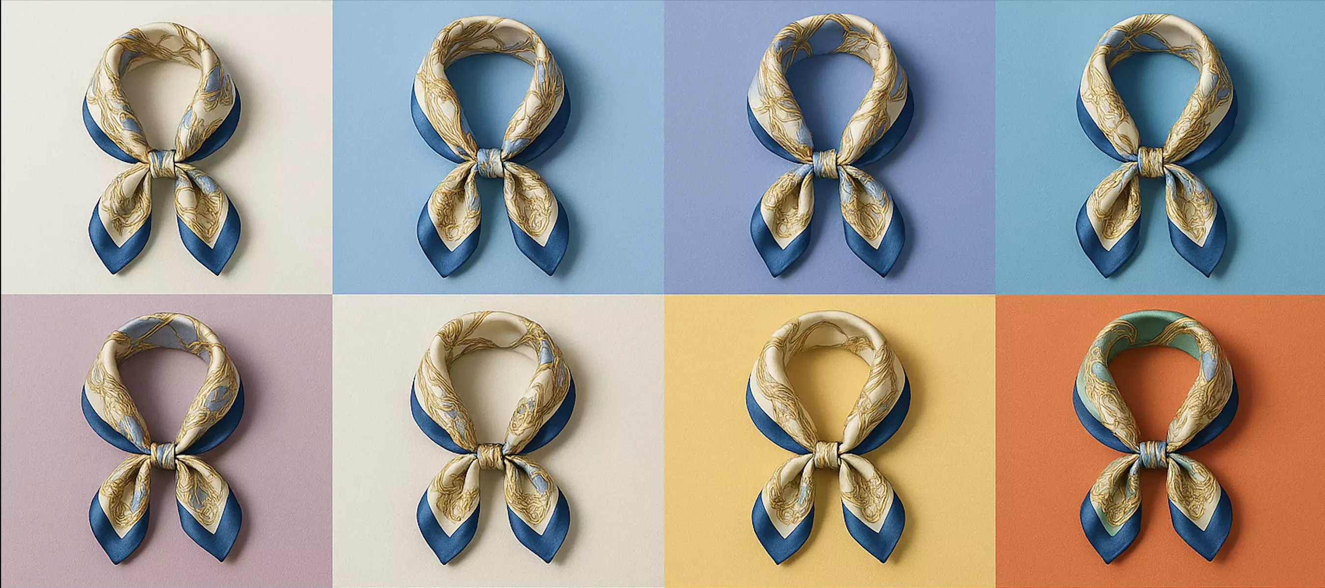
(See image suggestion: Side-by-side moodboard of linen, kraft paper, and soft brushed gold gradients under natural light.)
Why warm gold backgrounds complement sustainable fashion without greenwashing
- Gold signals warmth and craftsmanship. It sits in a neutral-warm space that flatters skin tones, linen, organic cotton, hemp, and recycled metal hardware.
- Low-saturation metallics read as premium without shouting. They elevate a product page or lookbook without stealing attention from the garment’s weave and drape.
- The current visual trend favors warm neutrals and subtle metallic accents, especially on mobile PDPs where textured backdrops reduce bounce and help users focus on detail.
The key is intent. If your materials, sourcing, and aftercare are genuinely better, a gentle gold background becomes a stage for your proof—not a marketing shortcut.
Color psychology and material cues: pairing gold tones with natural fibers
Gold plays nicely with:
- Linen, hemp, and unbleached cotton: use desaturated, brushed gold with a slightly cool edge to prevent yellowing.
- Recycled wool and knits: add a soft, diffused gradient to bring out depth without crushing shadows.
- Upcycled hardware and jewelry: lean into matte or satin gold to complement recycled brass or gold-plated accents.
Tips:
- Maintain color harmony. Sample a mid-tone from the product (e.g., flax linen) and nudge the gold hue to sit 10–15° warmer on the color wheel.
- Respect highlight realism. Metallic cues come from subtle specular highlights, not heavy glows.
- Control whites. Keep background luminance slightly darker than your brightest product highlight to avoid flare.
Truth-first messaging: claim boundaries, certifications, and verifiable proof points
Warm visuals cannot carry claims on their own. Pair your art direction with:
- Claim boundaries: specify “organic cotton shell, recycled poly lining” instead of “eco-friendly.”
- Certifications: GOTS, Fair Trade, OEKO-TEX, FSC for paper packaging; link certificates or batch numbers where possible.
- Proof points: mill names, country of origin, dye-process details, repair services, take-back programs, and lifecycle care guides.
When your captions and proofs are explicit, a gold background reads as considered design—never as cover-up.
Visual guidelines for a gold background: texture, lighting, shadows, and contrast
- Texture: prefer fine-grain paper, brushed metal, or soft vellum texture over glitter or mirror chrome. Keep it tactile, not flashy.
- Lighting: side or top-soft light to mimic natural daylight; avoid colored gels that skew fabric tones.
- Shadows: preserve soft contact shadows under hems and soles; they anchor the product and add credibility.
- Contrast: aim for medium contrast so weaves and seams remain visible on mobile; avoid deep vignettes that look theatrical.
- Saturation: keep gold saturation modest; think oat milk latte rather than trophy cup.
How to use Pixflux.AI to add a subtle gold background in three steps
Pixflux.AI helps you test quickly without heavy software. Here’s the fastest route to a clean, consistent gold background:
1) Upload your source photo Choose a well-exposed image with minimal motion blur.
2) Let the AI process the background Use background removal to isolate the product, then apply or generate a soft, low-saturation gold backdrop. Preview the lighting match and tweak warmth if needed.
3) Download your final image Export at your platform’s preferred resolution. Save a layered or alternate version if you plan to A/B test.
(See image suggestion: Pixflux.AI interface screenshots showing the three steps: upload, AI processing, and download.)
Pro tip: Keep a swatch note for your brand’s “house gold” (hex/RGB/HSB). Reuse it for consistent campaigns.
Editing workflow: background adjustment, object removal, and photo enhancement
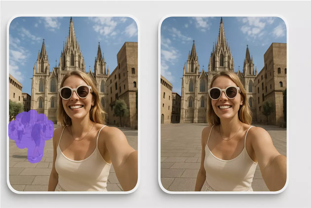
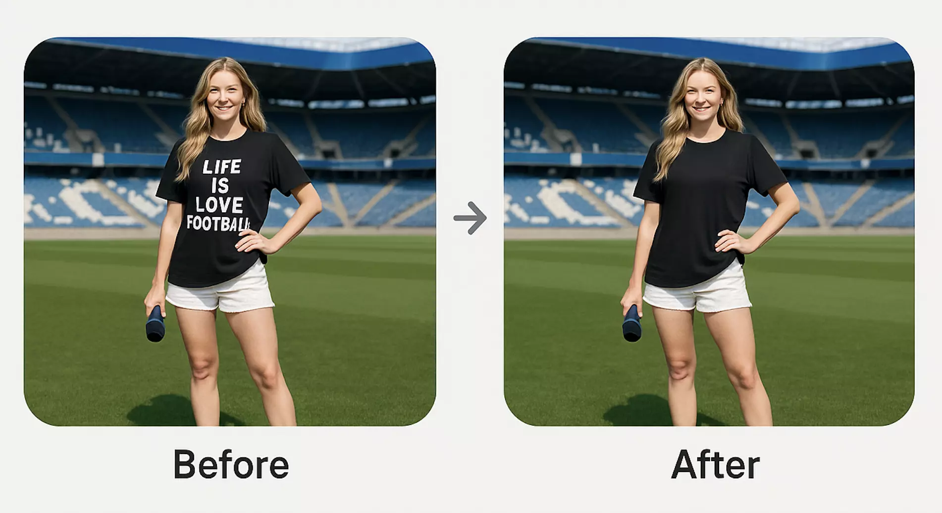
Refine your image with a simple sequence: 1) Remove distractions Clear stray props, cords, or packaging remnants. Pixflux.AI can remove unwanted objects cleanly so the product stays the hero.
2) Replace or adjust the backdrop Swap a busy studio setup for a subtle brushed gold, or adjust hue/saturation on an existing metallic backdrop to match your palette.
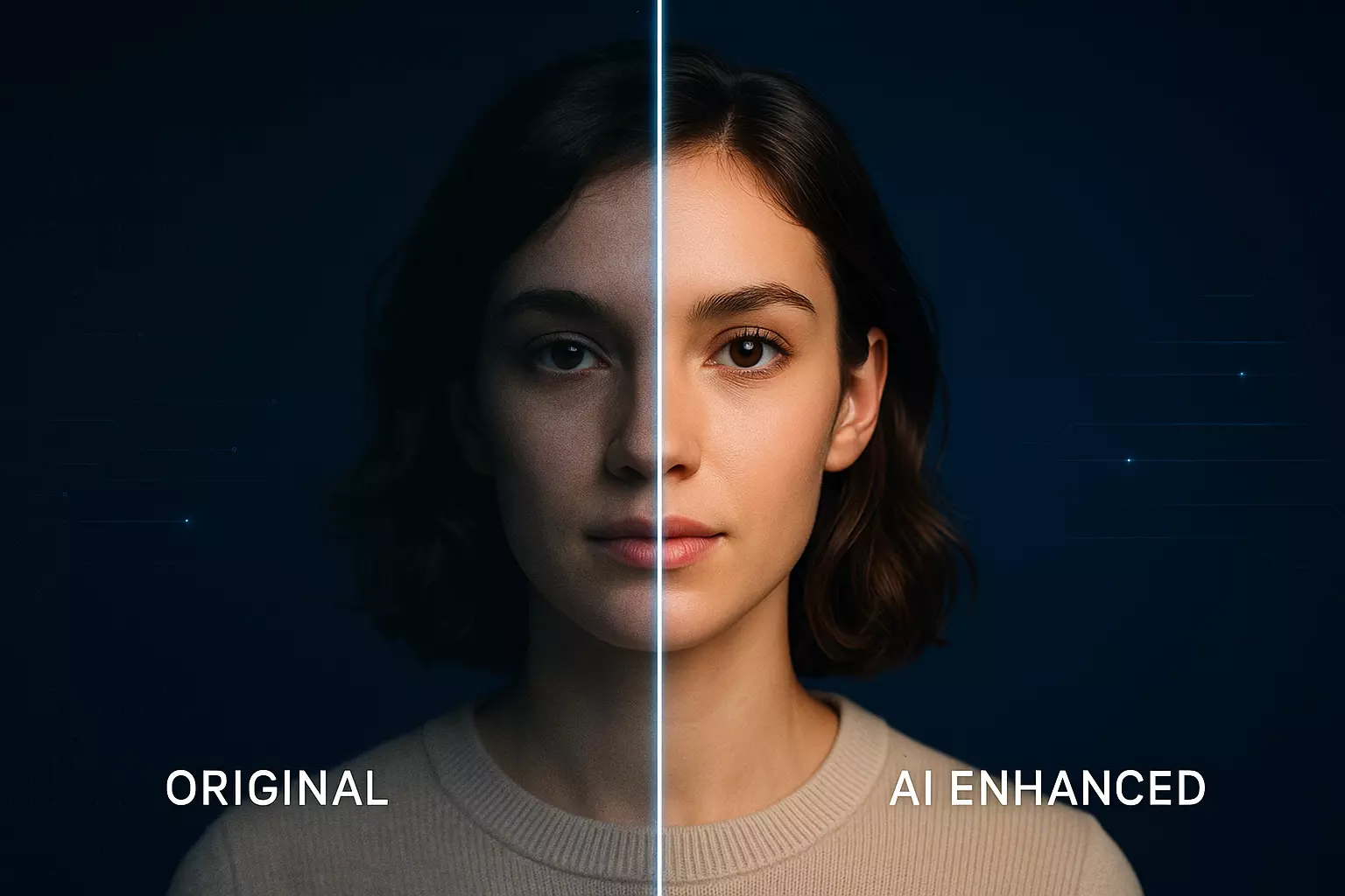
3) Balance lighting and contrast Use AI enhancement to gently increase clarity, lift midtones, and recover texture in highlights without over-sharpening.
4) Clean marks and water spots If you’re editing your own assets, use watermark removal to clear accidental marks or outdated logos. Only remove watermarks when you own the rights or have explicit permission.
5) Final pass for color accuracy Check that fabric color remains true; compare against a color-calibrated reference or a daylight snapshot.
(See image suggestion: Before-and-after product photo—cluttered scene replaced by a muted gold background with unwanted objects removed using Pixflux.AI.)
Case studies and before–after comparisons: what changes with gold backgrounds
Across brand tests and retailer lookbooks, teams often observe:
- Clearer product focus on mobile PDPs due to reduced visual noise.
- Perceived quality lift when metallic warmth complements natural fibers.
- More consistent grid views across collections, supporting faster browsing.
Where teams measured performance, many reported improvements in CTR and time-on-page after shifting from stark white or neon backdrops to textured gold. Your mileage will vary by category—A/B test variants to validate impact before rolling out.
Accessibility and ethics: alt text, watermark rules, and rights-respecting edits
- Alt text: describe the product first, then the setting. Example: “Women’s organic linen blazer in sand, photographed on a muted brushed gold background.”
- Color contrast: ensure legible overlays for price or badges; test with WCAG contrast tools when adding text on images.
- Rights and watermarks: only edit or remove watermarks on assets you own or are licensed to modify. Never use watermark removal to bypass copyrights or platform rules.
Caption and proof checklist for eco-fashion product pages and social posts
Use this quick checklist to keep visuals honest and helpful:
- Material breakdown with percentages (e.g., 80% organic cotton, 20% recycled polyester lining).
- Certification names and IDs (GOTS, OEKO-TEX), plus links or scannable proof where possible.
- Factory or mill region and audit status (without sharing sensitive personal data).
- Care instructions that extend garment life (e.g., cold wash, line dry, repair services).
- Packaging details (FSC paper, recycled mailers).
- End-of-life options (take-back, resale, or repair programs).
- Visual context note (e.g., “shot against a low-saturation gold background to highlight weave detail”).
Batch processing galleries while keeping brand consistency with Pixflux.AI
Seasonal drops and marketplace listings need speed. Pixflux.AI supports batch image processing so you can:
- Apply the same gold hue and texture across a whole collection.
- Remove backgrounds and tidy props for dozens of images in one go.
- Enhance clarity and align contrast ranges to a brand style guide.
To keep consistency, lock a color reference and export presets for recurring campaigns. When in doubt, A/B test one set before processing the entire gallery.
For hands-on editing, you can also start directly with the guided tool for a gold background and adapt the backdrop parameters as your baseline.
Troubleshooting color cast, banding, and over-saturation in gold backdrops
- Yellow color cast on fabric Solution: cool the gold hue slightly and lift exposure by 0.2–0.3 stops. Rebalance white point using a neutral gray in the product.
- Banding in gradients Solution: add a touch of fine-grain texture or mild dithering to the background; export at higher bit depth or a less compressed format.
- Over-saturation or “brassy” look Solution: reduce saturation 10–20% and soften highlights. Aim for matte sheen over mirror shine.
- Flat-looking garments Solution: reintroduce soft directional shadows and micro-contrast on the product only; keep the background calm.
AI tools vs traditional methods
- Time cost AI tools like Pixflux.AI reduce setup and retouch cycles from hours to minutes, especially when swapping backdrops or cleaning objects. Traditional manual edits in heavyweight software are precise but slow—fine for hero images, less ideal for full catalog updates.
- Learning curve Online tools are designed for non-specialists. Designers still benefit, but merchandisers and social managers can ship updates without deep retouch skills. Pro suites need ongoing training and template maintenance.
- Batch efficiency Batch background edits and enhancements help large teams keep rhythm across product refreshes. Manual batch actions often break on edge cases, requiring repetitive fixes.
- Cross-team alignment With consistent backdrops and simple presets, marketing, merchandising, and studio teams align on one look without long handoffs or rebriefs.
FAQ: Gold backgrounds for sustainable fashion visuals
Will a gold background make my brand look like it’s greenwashing?
No—if your claims are specific and backed by proof, gold simply adds warmth. Use the backdrop as a stage, not a claim. Pair images with verifiable certifications, material breakdowns, and care guidance. Keep the gold low-saturation and textured so the garment stays the hero.
What shade of gold works best with natural fibers like linen or hemp?
Desaturated, slightly cool golds work best for plant-based fibers. This avoids pushing fabric into yellow territory and preserves true color. Sample your garment mid-tones and adjust the background hue to sit just warmer, keeping luminance below your brightest product highlights.
Can I use batch editing to apply a gold look across my entire catalog?
Yes—batch processing is ideal for consistent art direction. Use Pixflux.AI to process multiple images at once with the same gold hue and texture, then spot-check edge cases (sheer fabrics, chrome hardware) to ensure color accuracy and realistic shadows.
Will a gold backdrop conflict with marketplace image rules (e.g., Amazon, Etsy)?
It depends on the platform; some require white or very light backgrounds. Check the latest specs for each marketplace. If white is mandatory on main images, reserve gold backgrounds for secondary images, brand sites, or social, and keep a compliant version for the primary listing.
How do I avoid banding in soft gold gradients on mobile?
Add subtle texture or mild dithering and export with sufficient bit depth. Fine paper grain or brushed-metal textures hide gradient steps. Avoid aggressive compression; preview on a mid-range mobile device before publishing.
Is watermark removal acceptable for my product images?
Yes—if you own the rights or have explicit permission. Use removal to clear outdated marks or studio stamps on your assets. Do not remove watermarks from images you don’t own or lack rights to edit; respect copyright and platform policies.
Will AI editing change my product color and mislead shoppers?
It shouldn’t, provided you monitor color and keep adjustments subtle. Always compare results against a color-calibrated reference or daylight photo. Focus your edits on background, cleanup, and mild clarity—avoid heavy saturation shifts on the product itself.
Quick 5-step advanced workflow (optional)
For teams needing finer control, try this extended sequence in Pixflux.AI: 1) Open the tool and upload your original image 2) Select background removal, then choose a muted gold backdrop 3) Preview lighting match; adjust warmth and gradient angle 4) Remove stray objects, enhance clarity, and fine-tune contrast 5) Download final and alt versions for A/B testing
Conclusion and next steps
Gold backgrounds are trending for the right reasons: they add calm warmth, suggest craft, and help products shine on mobile—without compromising honesty. When paired with specific claims and proof, they support trust and reduce visual noise across PDPs and social.
Ready to test the look across your catalog? Try a subtle gold backdrop for sustainable fashion with Pixflux.AI, iterate quickly, then lock your winning style for consistent, rights-respecting visuals.